Interface
From FlyFF WIki
This article is actively being worked on by ChriSter. Expect more content to be added in the future.
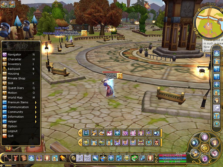
Due the latest version update (V19) that's called Flyff Gold, the interface has changed drastically. This page will be used in order to show and explain about the new interface and hopefully make it better to get adept to it.
For the players who played before V19, you can see that the look changed completely. For the new players who started in V19 you can see the rest for some information or just play the game.
The new interface is completely different due the update of V19, that is called Flyff Gold. They went with the theme and chose for darker colors with gold.
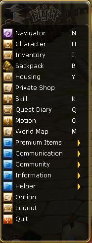
As you can see, the menu is smaller to click on, which can be found in the left down corner and when you open you'll see this. There haven't been changes much, except for the HP, MP, FP, Exp bar that you could open with T. That got changed to a new feature Eldin's Jar and the HP, MP, FP, Exp bar is moved to the middle + down right.
So in order to check your exp and how much you need to lvl up, you have to check the little bar that is below your main bar.
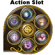
There is a different action slot now. Instead of 5 skills, you can do 6 skills which is nice. There is just one downside. It doesn't matter if you put in 1-2 skills or a full slot of 6 skills, there will always be a cooldown of 12 seconds every time the last skill has been casted. The only way to keep using the action slot would be by using an (Enchanted) Activation.
Friend list almost stayed the same, but got different colors. You also see 2 buttons in left corner. One is for adding friends, the other is one that will save the messages when you are offline. People can send you a message if they have you in their friend list by right clicking on your name and use the Send a memo. option.
This is the main bar that can be used for skills, items, shouts, etc. This is controlled by the normal numbers 1 to 0.
You can also expand the bar for more space, but they do not have keys attached, so it requires a mouse click.
This is the second bar you can use for skills, items, shouts, etc. This is controlled by A number 1 to 0.
Now you're asking yourself, what's A? The A stands for Alt. So you keep Alt pressed in and click on a normal number. As example in the picture, if I would keep Alt pressed in and click on 1, I'd cast Protect on either myself or someone else that I got targeted.
You can move this bar around to a place where you prefer.
This is the third bar you can use for skills, items, shouts, etc. Anyone who played before V19 don't really need an explanation for this one. This bar is controlled by the F keys, so from F1 till F0 which was the keys we used before the V19 update.
You can move this bar around to a place where you prefer.
This is the fourth and last bar you can use for skills, items, shouts, etc. There are no keys attached to it, so you're required to mouse click them to activate whatever you place on it.
You can move this bar around to a place where you prefer.
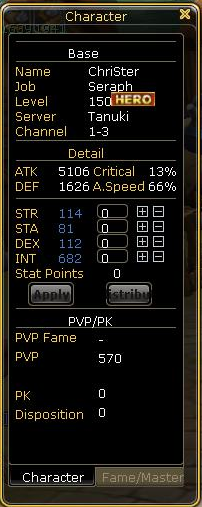
This is where you can find the stats of the character. No real changes for except the color. You can get here by pressing H in game.
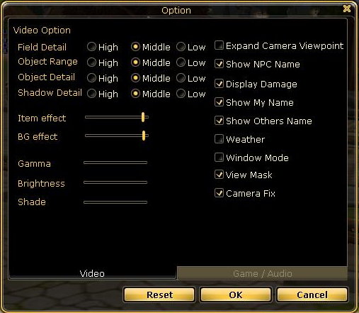
This is the option menu. When you open the menu and press on option, you will see this first. You can change the settings here. There haven't been much changes here, for except the color.
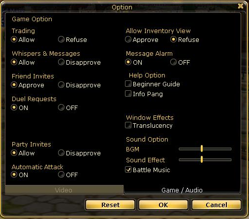
If you are at the option settings, this can be seen if you click on the second tab. You can change the settings here as well. There haven't been much changes here, for except the color.
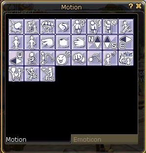
Motions stayed the same, just different color.
This is the new private shop window, pretty much the same for except the color. However, there is one point you need to pay attention to. You cannot open a shop anywhere anymore. So you can't open a shop in Flaris, Saint Morning, Darkon, etc. With the V19 update we got a new place that's called Madrigal Market Place and you can only open a private shop there. There also is another system there where it allows you to sell items in game without having to stay logged in. Currently you can sell 3 items per character until we will get a CS items that allows you to sell up 50 items per character for 7 days.
Note: If you want to use this service, keep in mind that you have to pay a fee of a small percentage in order for your item to be in the market so that people can see/find your item and possible sell if they are interested in it. The fee is being asked and deducted when adding an item in the list. Not afterwards, but right away.
On the right you'll see 2 bars. A Red one, that's for the (remaining) HP of the target and the blue one, that's for MP.
On top you see the name of the monsters, self explanatory.
On the left, inside the gem, you will see a number and a color. The number indicates the level of the monster and the color (gets explained more below) indicates the element.
Next to it, you will see a total of 6 beads. The more lit, the dangerous the monster is. There are also 3 different colors for the beads.
blue = normal monsters
red = instance dungeon monsters
purple = premium monsters.
Below the bar you can also see what kind of (de)buffs the monster has.
These are the colors the monsters can show.
From left to right: Fire, Wind, Earth, Electric, Water, Neutral.
Above you see the name of the character. The 2 bars are the (remaining) HP (red) and MP (Blue).
The gem shows what class it is. In this case it's a Seraph.
With this you are able to find out what class everyone is. Of course you can see whether they are normal lvl, master or Hero, but now you're also able to see whether they are a 3rd job already.
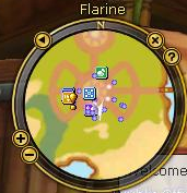
This is the new mini map as you can see. Instead of being a square, it's round now. You can also move it if you press above on the N (of North). The + and - can be used if you want to enlarge the place you see on the mini map, or shrinking it.
The button with the triangle in it can be used if you want to filter. Do you want to see monsters on it, players, party members, NPC or not? You can decide for yourself.

